Classification Algorithms
Preprocessing Data
This is the first step to any Machine Learning task that involves removing outliers, reducing the dimensions of the data set or amount of variables, and splitting the dataset into test and train data sets. To improve a model it is important to use Cross-Validation so that you can get the most out of your data set. To explain Cross-Validation, the first step is to reconstruct the data set which means dividing the data set into four or five partitions and then using one of the partitions to test the model. Now that the data set is partitioned we can Cross-Validate by using different partitions to train and test the model each time we run it. This enables the user to make thorough use of all the data in the data set. This can easily lead to overfitting; meaning that the model predicts almost all of the records in the test data set. And while this doesn’t sound terrible it’s not good when you realize what overfitting actually is. Overfitting refers to a model that is overcomplicated to correctly predict each item in the test data set. This makes the data set only relevant to the sample and not the population. When this happens you should add more items to the data set and if the prediction accuracy is stable then you have yourself a useful model.
For this website I will not be showing any of the preprocessing steps for the data set because that’s a quick way to lose someones attention. So we will go into building Classification models.
Classification Algorithms
There are several different types of Classification algorithms that are all used to predict whether something does(1) or doesn’t(0) happen. This could be used for deciding when the best time to steal would be. 1 would be them making it safely and 0 would be them getting out. The model would give a baserunner a number between 1 and 0 based on how likely they are to steal the next base successfully using their reaction time, speed, and information about the pitcher and catcher. In a multivariate Classification algorithm, there are more than two choices. For example, you might want to know how far a AA player will go in their career based on their stats. 0 would be that they are predicted to stay in AA forever, 1 would be that they will reach AAA, and 2 would be that they reach the big leagues.
To show examples of classification techniques I will be trying to predict whether a team wins or loses based on their end of the year stats. This model would be better if I instead used who was pitching that day and the team’s lineup but I am not planning on using this model for financial gain but rather to inform you about different Classification techniques. I also do not plan on having a high prediction accuracy because baseball, like any sport, can have a very random outcome. It is only important to get an accuracy over 52.83% because that would be the prediction accuracy of a model that predicts the home team to win every game.
Data Visualization
The first thing we need to do is gain further understanding of the data set. This is done by inspecting and visualizing the data set. Below I have created plots that look at what variables or statistics might have a higher correlation compared to whether a team won or the score of the game.
## Loading required package: ggplot2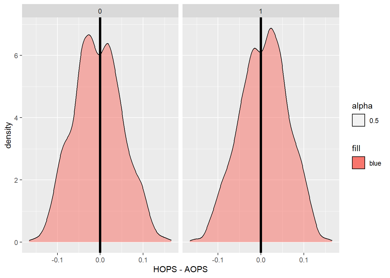
## 1 means the home team wins and 0 means the away team wins## As you a can see when a team has a higher average OPS they are slightly more likely to win and this is more prominent when the team with the higher OPS is the home team.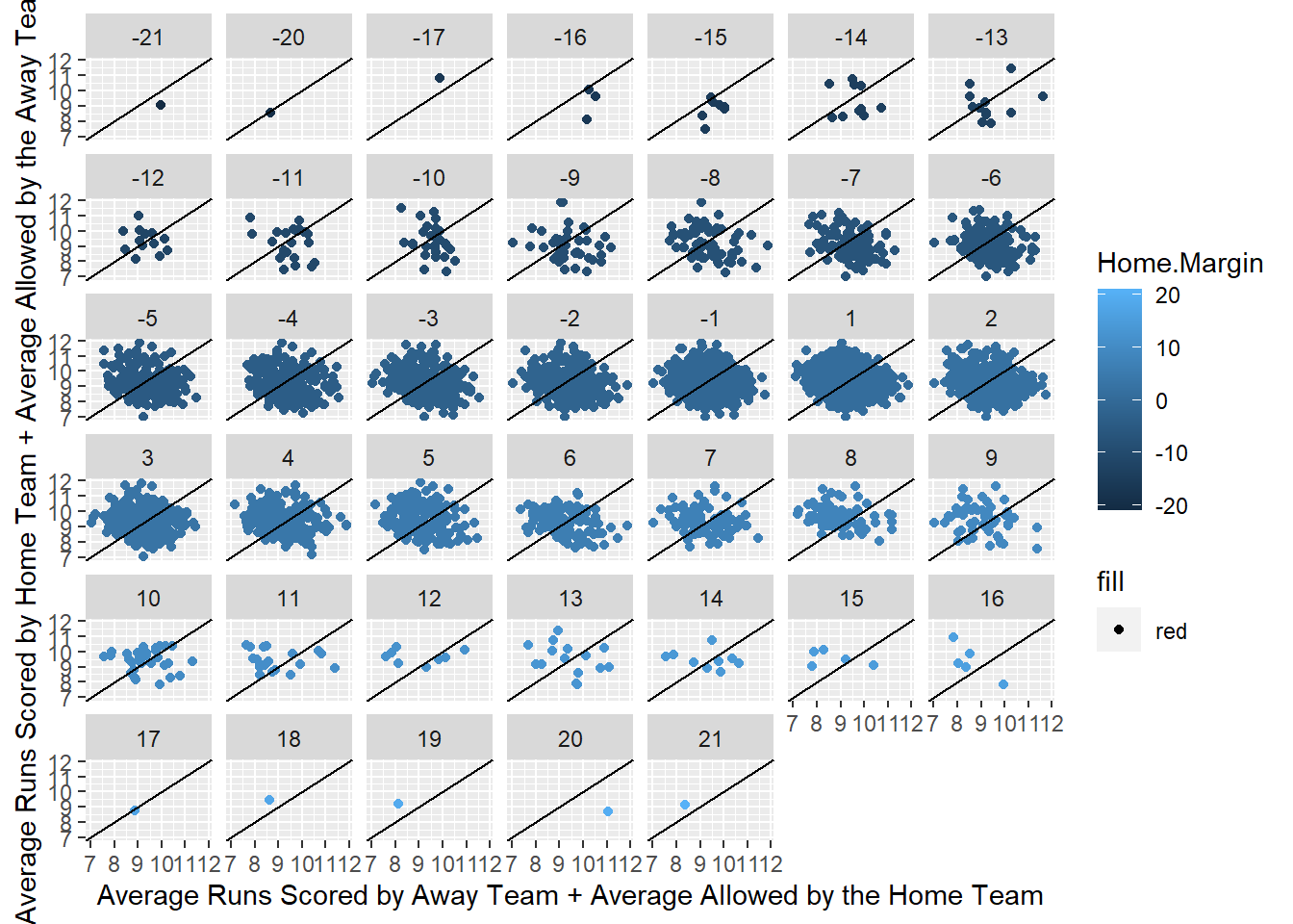
## The goal for this grid of plots is to show that a team with a higher average runs scored with a higher average runs allowed for the other team results in more wins for the team with the higher combined average so when the dots are dark blue there should be more below the dissecting line and vice versa for the light blue dots.## It is clear that these variables are not going to be terrific for predicting who is going to win but could potentially give us a slightly better idea than randomly guessing or just predicting the home team will win.## AOPS HOPS Abage AR.G ASO ALOB
## [1,] -0.08060033 0.06646345 0.001519782 -0.08509722 0.02821488 -0.05637687
## HBage HoR.G HSO HLOB APage AW.L
## [1,] 0.009526019 0.0697088 -0.05041229 0.04877061 -0.05017487 -0.1001956
## AERA AFIP AWHIP AHR9 ABB9 ASO9
## [1,] 0.08840411 0.08284435 0.09316628 0.04554047 0.05336882 -0.106545
## HPage HW.L HERA HFIP HWHIP HHR9
## [1,] 0.03641626 0.08526575 -0.07136769 -0.07227214 -0.07150732 -0.04668699
## HBB9 HSO9 ARA.G ADefEff AE AFLD.
## [1,] -0.04056186 0.07511363 0.087955 -0.05032231 0.03077516 -0.02827066
## HRA.G HDefEff HE HFLD. AContact APower
## [1,] -0.07311748 0.03990662 -0.04199809 0.04080187 0.06337934 0.06191157
## APitching ADefense ASpeed HContact HPower HPitching
## [1,] 0.08860436 -0.02451712 0.05536 -0.04979859 -0.03834685 -0.07352705
## HDefense HSpeed
## [1,] 0.006535868 -0.02568789## These numbers above are correlations showing how each variable interacts with the margin of the home team's score minus the away team's. This gives us more clarification that none of the variables are going to be tremendously useful in predicting who will win and yes I did pull team ratings in each category (pitching, contact, speed, etc) from MLB:The Show to see if they would be useful.
##
## We want to see numbers with absolute values close to 1 not 0 and well you have eyes that work if you're reading this.Now that we have an idea of how the variables interact with each other we can be quite confident that our model is not going to be tremendously useful or accurate but we will continue anyways which would not be recommended by anyone.
Generalized Linear Model
The first place I like to start is with a Generalized Linear Model because it has similar characteristics to a simple linear model. In fact a linear model would be a Generalized Linear Model or GLM but like a rectangle can be more than a square, a GLM can be more than just linear. It can have a distribution that correlates with any exponential family. The exponential family I chose for predicting the winner of each game was Gaussian because it generally does better at predicting random events. Gaussian is just a fancy word for a normal distribution.
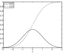
We will be fitting our model to the distribution like the one shown above except the mean and standard deviation won’t be 0 and 1 respectively but will instead be fitted to the model’s values. The CDF (Cumulative Density Function) shows the proportion of the PDF (Probability Density Function) that is less than or equal to each random variable, which is x in the image above. Taking the derivative of the cdf will return to you the pdf but you would usually start with the pdf and integrate to get the cdf.
## The following objects are masked from data:
##
##     Abage, ABB9, AContact, ADefEff, ADefense, AE, AERA, AFIP, AFLD.,
##     AHR9, ALOB, AOPS, APage, APitching, APower, AR.G, ARA.G, ASO, ASO9,
##     ASpeed, AW.L, AWHIP, HBage, HBB9, HContact, HDefEff, HDefense, HE,
##     HERA, HFIP, HFLD., HHR9, HLOB, Home.Margin, Home.W.L, HOPS, HoR.G,
##     HPage, HPitching, HPower, HRA.G, HSO, HSO9, HSpeed, HW.L, HWHIP
##
## Call: glm(formula = Home.W.L ~ (HOPS - AOPS) + (HoR.G + ARA.G) - (HRA.G +
## AR.G) + (HPitching - APitching), family = "gaussian", data = train)
##
## Coefficients:
## (Intercept) HOPS HoR.G ARA.G HPitching
## 0.392510 -0.716605 0.075056 0.076014 -0.002155
##
## Degrees of Freedom: 3743 Total (i.e. Null); 3739 Residual
## Null Deviance: 933.1
## Residual Deviance: 921.7 AIC: 5389## The AIC is similar to the least squares measurement in a linear model. The AIC is very high which is not a good sign## Actual
## Predicted 0 1
## 0 154 135
## 1 287 361## Below is the prediction accuracy of the model on the test data set and above is a Confusion Matrix that despite its name is rather simple. The matrix shows how many records were actually 0 and predicted to be 0, how many were predicted to be 0 and were actually 1 and so on. Below that is the prediction accuracy which is the total amount of records predicted correctly divided by the total amount of records.## [1] 0.5496265## Loading required package: pROC## Type 'citation("pROC")' for a citation.##
## Attaching package: 'pROC'## The following objects are masked from 'package:stats':
##
## cov, smooth, var## Above is just me loading the pROC package so that it can be used later for the ROC curves which i will further explain in the comparison section of this page.## Setting levels: control = 0, case = 1## Setting direction: controls < casesSupport Vector Machines
This technique uses its background in linear algebra to perform statistical learning of data sets and uses statistical theory to create, more often than not, accurate results. The Support Vector Machine is very effective in high-dimensional data, and unlike other classification techniques it avoids the curse of dimensionality which just happens when a data set has too many variables. For this model I am just going to use all 44 variables because SVM works better than most models for data sets with a lot of variables and I am curious to see the results. SVM is a very powerful model that creates a generalized relationship between variables using a line that provides the greatest margin between all the points. It also employs high level mathematics that are good for avoiding overfitting which would be very hard for any of these models to represent because it’s going to be hard for any model to predict the orioles beating the Yankees one game and then losing the next one, especially with the variables that I am using in this model which don’t change from game to game. To use this function in R you will need to install the e1071 package. 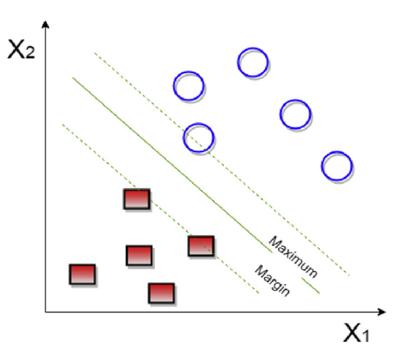
##
## Call:
## svm(formula = Home.W.L ~ Abage + ABB9 + ADefEff + AE + AERA + AFIP +
##     AFLD. + AHR9 + ALOB + AOPS + APage + AR.G + ARA.G + ASO + ASO9 +
##     AW.L + AWHIP + HBage + HBB9 + HDefEff + HE + HERA + HFIP + HFLD. +
##     HHR9 + HLOB + HOPS + HoR.G + HPage + HRA.G + HSO + HSO9 + HW.L +
##     HWHIP, data = train)
##
##
## Parameters:
##    SVM-Type:  eps-regression
##  SVM-Kernel:  radial
##        cost:  1
##       gamma:  0.02941176
##     epsilon:  0.1
##
##
## Number of Support Vectors:  3455
## Actual
## Predicted 0 1
## 0 182 167
## 1 259 329## [1] 0.5453575##
## Call:
## roc.default(response = test$Home.W.L, predictor = roundsvmpredict)
##
## Data: roundsvmpredict in 441 controls (test$Home.W.L 0) < 496 cases (test$Home.W.L 1).
## Area under the curve: 0.538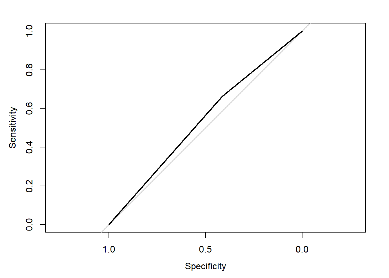
I will describe what this plot and the numbers mean at the bottom of the page. To see if the SVM model is more accurate than using a Generalized Linear Model we will use the same formula for both.
##
## Call:
## svm(formula = Home.W.L ~ (HOPS - AOPS) + (HoR.G + ARA.G) - (HRA.G +
##     AR.G) + (HPitching - APitching), data = train)
##
##
## Parameters:
##    SVM-Type:  eps-regression
##  SVM-Kernel:  radial
##        cost:  1
##       gamma:  0.25
##     epsilon:  0.1
##
##
## Number of Support Vectors:  3394
## Actual
## Predicted 0 1
## 0 134 112
## 1 307 384## [1] 0.5528282The model with less variables performed better than the model with all of the variables because even though they had the same area under the ROC curve the model with less variables had a higher prediction accuracy.This is at least somewhat of decent indication that the variables I chose were better than the average group of variables in the data set.
Random Forest Model
A forest is a bunch of trees and this is surprisingly a useful way to help describe the Random Forest algorithm. The first thing we need to define is what a tree is in this scenario. Well a tree is something that has a trunk and as it grows it gains more and more branches with leafs attached to the end of the branches and now I have annoyed you but there is a good reason for this I promise. A Random Forest model selects a chosen number of decision trees at random to make a generalized tree from the forest of trees making it an ensemble learning method. This means that it aggregates the predictions of multiple classifiers to create a more accurate model. A decision tree has internal nodes which are variables that are selected for the model and then branches extend from the node based on how the node is chosen to be split by the model.For example, this model might say that if the OPS is greater than .800 then the team wins if it’s less than .800 then they lose. The final part is the leaf node which for a uni-variate classification model is just yes or no depending on the branch it is connected to. I will create the model using the same formula so that the methods can be compared. 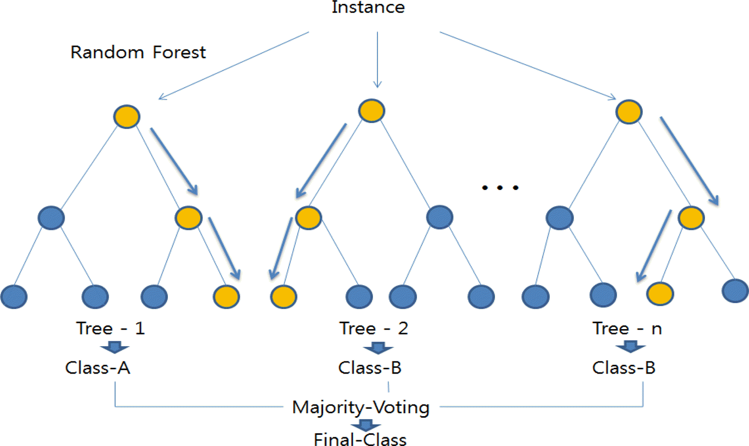
##
## Call:
##  randomForest(formula = Home.W.L ~ (HOPS - AOPS) + (HoR.G + ARA.G) -      (HRA.G + AR.G) + (HPitching - APitching), data = train, importance = TRUE,      replace = TRUE, ntree = 5000)
##                Type of random forest: regression
##                      Number of trees: 5000
## No. of variables tried at each split: 1
##
##           Mean of squared residuals: 0.2571082
##                     % Var explained: -3.17
## Actual
## Predicted 0 1
## 0 187 165
## 1 254 331## [1] 0.5528282Boosting
Boosting is an iterative procedure to adaptively change the distribution of training data by focusing more on previously misclassified records. For this model we will be using a type of Boosting called AdaBoosting which is just a specific method on how to increase the weights of incorrectly classified records and decrease the weights of the correctly classified records. This method of classification is similar to another type of ensemble learning method called bagging except with bagging the weights remain the same after each round of training. Now I will run the horrendously terrible formula again but with the AdaBoost function in hopes for a better outcome. Knowing how the variables were created this method should not produce very good results for the same reason that there could never be overfitting in these models. There is a ton of multicollinearity within the independent variables. To avoid this and make a useful model you should use variables that can be pulled before each game that are also unique for each game such as the starting pitcher’s era or the starting lineups batting average. Obviously those will probably not be the best but they will produce a more useful model than the ones I have made with this awful data set that I scraped off the first baseball website I found with team statistics.
## adaboost(formula = Home.W.L ~ (HOPS - AOPS) + (HoR.G + ARA.G) -
##     (HRA.G + AR.G) + (HPitching - APitching), data = train, nIter = 50)
## Home.W.L ~ (HOPS - AOPS) + (HoR.G + ARA.G) - (HRA.G + AR.G) +
##     (HPitching - APitching)
## Dependent Variable: Home.W.L
## No of trees:50
## The weights of the trees are:0.32153860.27754610.23268870.19699080.18083590.16227970.14621380.13233470.12757720.12572560.11361670.11146160.10692570.10189410.099537280.1000230.090769260.086787880.085237920.083035880.082149660.076815790.072747330.077861170.07119320.066348410.069046830.070997170.066438960.066822840.061621640.062184970.060850140.057827470.057538240.057766030.057147880.054704380.051825380.051150770.051882870.048593810.04784340.048787570.045850780.0459550.041689010.043180160.042109790.04128738
## Actual
## Predicted 0 1
## 0 102 104
## 1 339 392## [1] 0.5272145Comparing Classification Models
You could just use the first model you made but the first one is very unlikely to be the best. The goal should always be to find the best model that is the most useful and that will usually require a lot of small adjustments. There are two main ways that models can be compared. The first one is just by getting the prediction accuracy which I have already showed for each model but I will make a table below with the same values so that they can be easily compared.
The second one is a little less straight forward but also a very good techniques for comparing and seeing how comfortable the machine is choosing 1 or 0. This method consists of looking at ROC curves which are actually called Receiver Operating Characteristics curves but I will stick with ROC. The goal is to have the area under this curve be as large as possible because if the area is .5, which is as small as it can be. This means that the machine is randomly guessing and we don’t want that. With the multicollinearity filled data set I used the area under the curve is bound to be close to .5 but with a better data set you would like to see a number around .7 or higher.
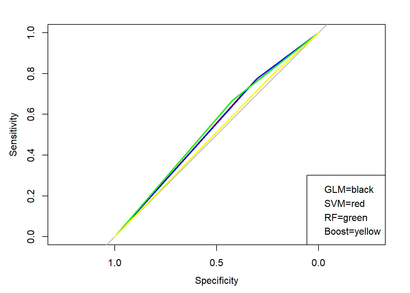
## GLM##
## Call:
## roc.default(response = test$Home.W.L, predictor = roundglmpredict)
##
## Data: roundglmpredict in 441 controls (test$Home.W.L 0) < 496 cases (test$Home.W.L 1).
## Area under the curve: 0.5385## SVM##
## Call:
## roc.default(response = test$Home.W.L, predictor = roundsvmpredict)
##
## Data: roundsvmpredict in 441 controls (test$Home.W.L 0) < 496 cases (test$Home.W.L 1).
## Area under the curve: 0.539## RandomForest##
## Call:
## roc.default(response = test$Home.W.L, predictor = roundRFpredict)
##
## Data: roundRFpredict in 441 controls (test$Home.W.L 0) < 496 cases (test$Home.W.L 1).
## Area under the curve: 0.5457## adaBoost##
## Call:
## roc.default(response = test$Home.W.L, predictor = adapredict$class)
##
## Data: adapredict$class in 441 controls (test$Home.W.L 0) < 496 cases (test$Home.W.L 1).
## Area under the curve: 0.5108## Loading required package: reactable## Warning: package 'reactable' was built under R version 4.0.2As you can see the area under the curve for each classification technique is between .55 and .50 which is terrible and means that the machine is practically guessing. The prediction accuracies for the Support Vector Machine and Random Forest models are the highest at 55.28% each. This is above 52.83% so it is more useful than just guessing that the home team will win. Overall the Random Forest model performed the best with both the highest area under the ROC curve and the highest prediction accuracy. With that said the model was still not great as changes to the data set to include game-to-game statistics should be added, especially to reduce the multicollinearity within the data set.